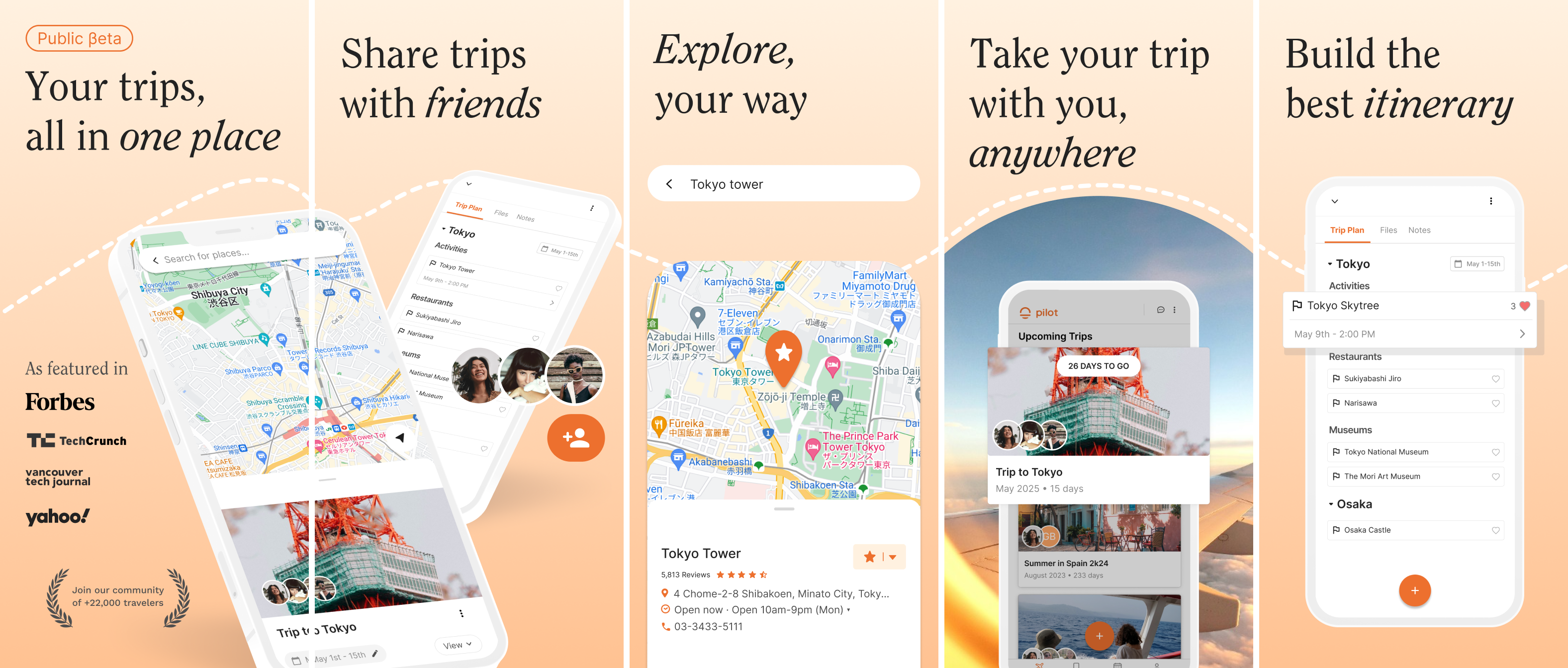
Pilot is a collaborative travel planner for groups to discover, plan, and book, all in one place.
I lead the design efforts and product vision at Pilot where I successfully increased user activation by 45% and grew lifetime users to +20,000 across the web app, including hotel search & booking flows. I also designed the "Quick Start" AI feature, which helped raise +$300,000 from investors. By conducting A/B tests, I improved the conversion rate of "Quick Start" by 30%.
Additionally, I’ve facilitated +30 user interviews and surveys, to inform long term product strategy and quarterly roadmaps. I also designed, tested, and released the Pilot mobile app for iOS and Android. Throughout this process, I lead weekly collaborative design workshops with engineers, product managers, and the CEO to ensure alignment on new features.
I also hired and now mentor a junior designer after reviewing candidates and design challenges.

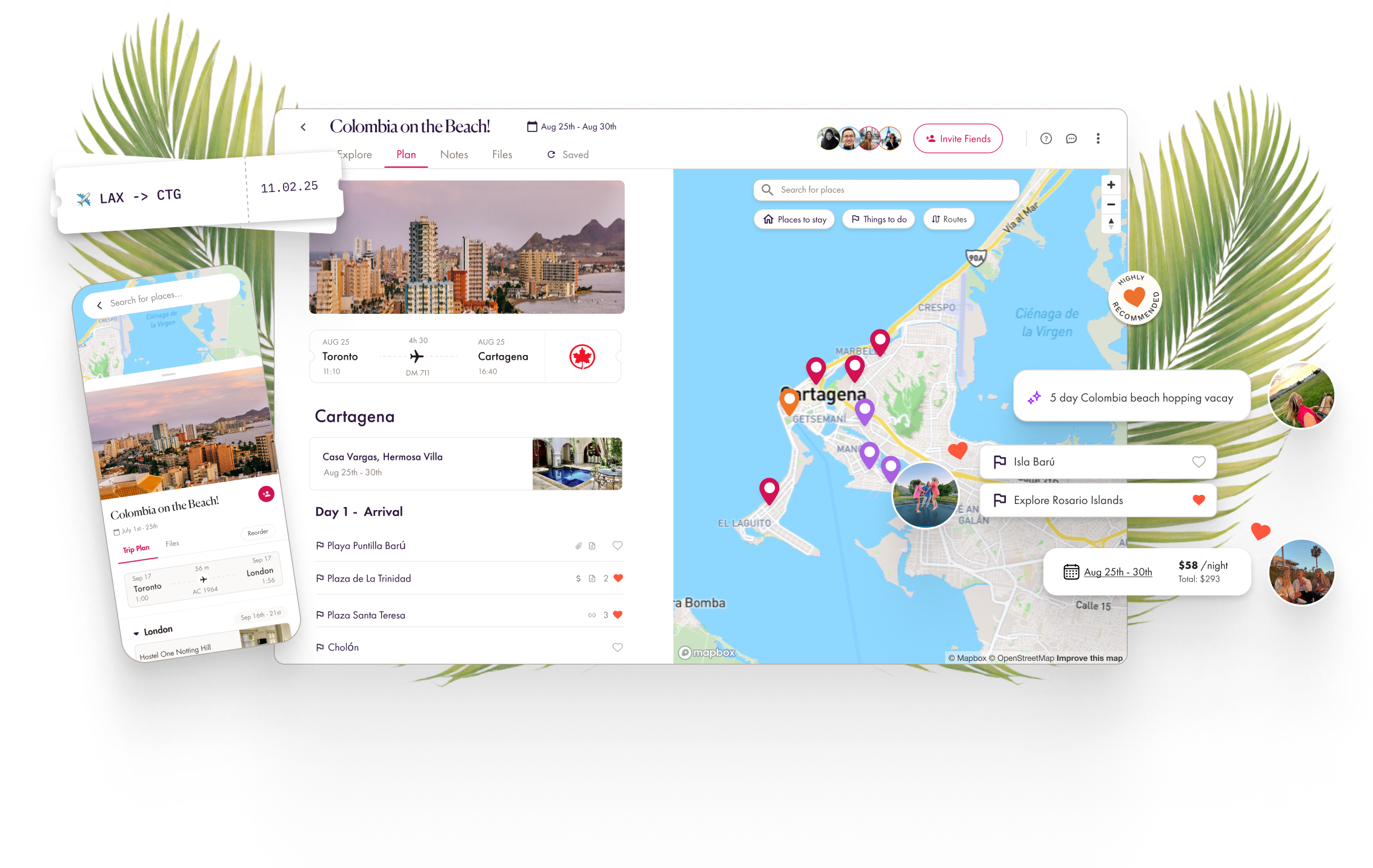
Create a Trip Flow & Quick Start
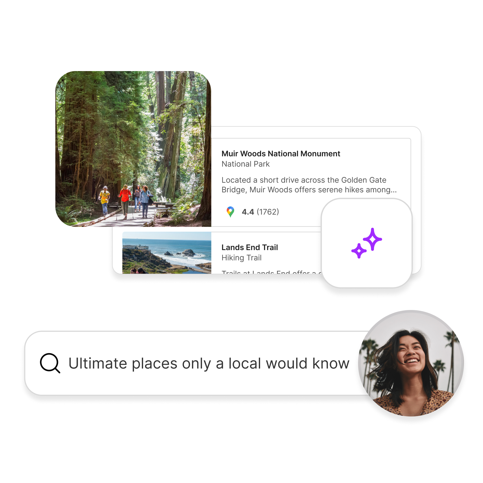
Our users love of having “everything in one place” so they can discover, book and plan their trip in an organized way.
To meet this need, Pilot was initially conceived as a trip planner, while trip discovery largely happened outside our app. To bring more of the trip process together in one place, I designed an introductory Create a Trip flow and the Quick Start AI feature.
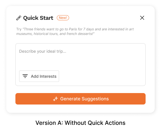
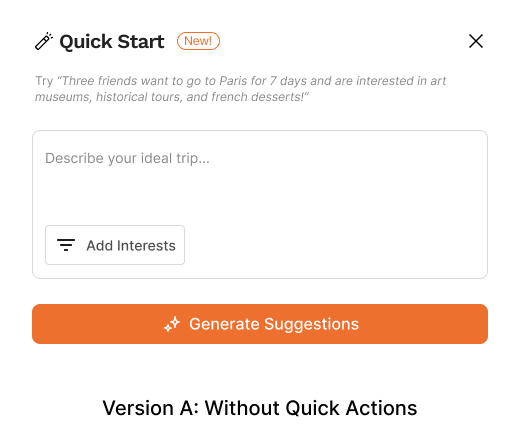
Quick Start leverages GPT 3.5 to initiate users into the process of trip planning, suggesting jump off points for more research. It works like an appetizer to spur them on to planning more activities on their trip.
How can we empower travellers with AI while maintaining a sense of ownership?
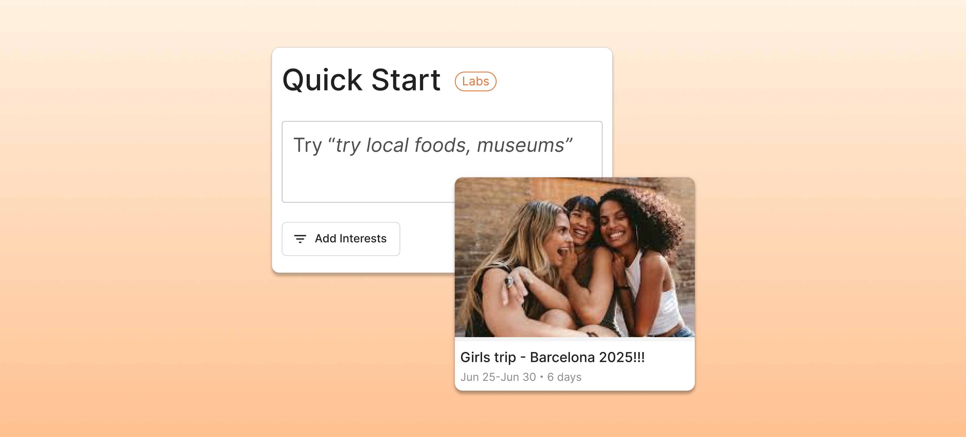
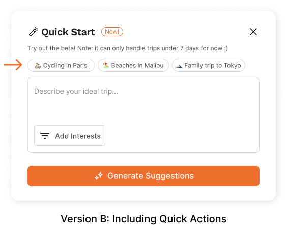
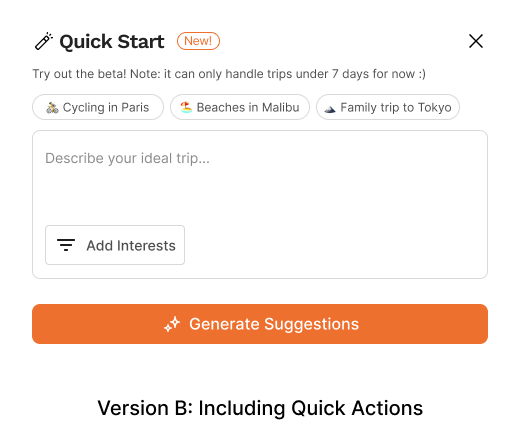
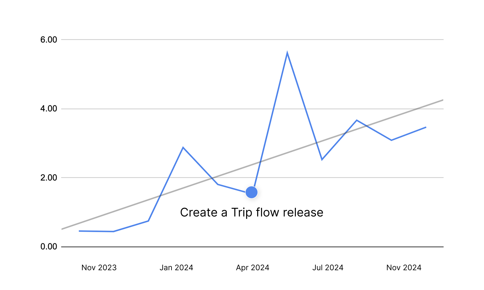
When we initially launched Quick Start we had some assumptions about how users might want help getting ideas for prompts to input. We included “Quick Action” buttons that gave them ideas on how to start, such as, “4 day itinerary for a family of four in Italy”. An A/B test found that more people submitted prompts using Quick Actions, however fewer of them continued using Pilot, resulting in lower overall activation. This finding is consistent with the Endowment Effect whereby people have an emotional bias toward something simply because they own it. The A/B test illustrates this Effect and demonstrates the importance of testing assumptions.
Positive Outcomes:
We found that activation rose, specifically the number of people who signed-up and created at least 20 itinerary items - not including those generated by Quick Start. In Spring 2024, Pilot was featured in Tech Crunch,
Phase 2: Improved Onboarding and Referral through Create a Trip Flow
Setting out to improve activation even further, we began experimenting with a series of onboarding screens that set up basic details for the trip and provided more context for the Quick Start prompt.
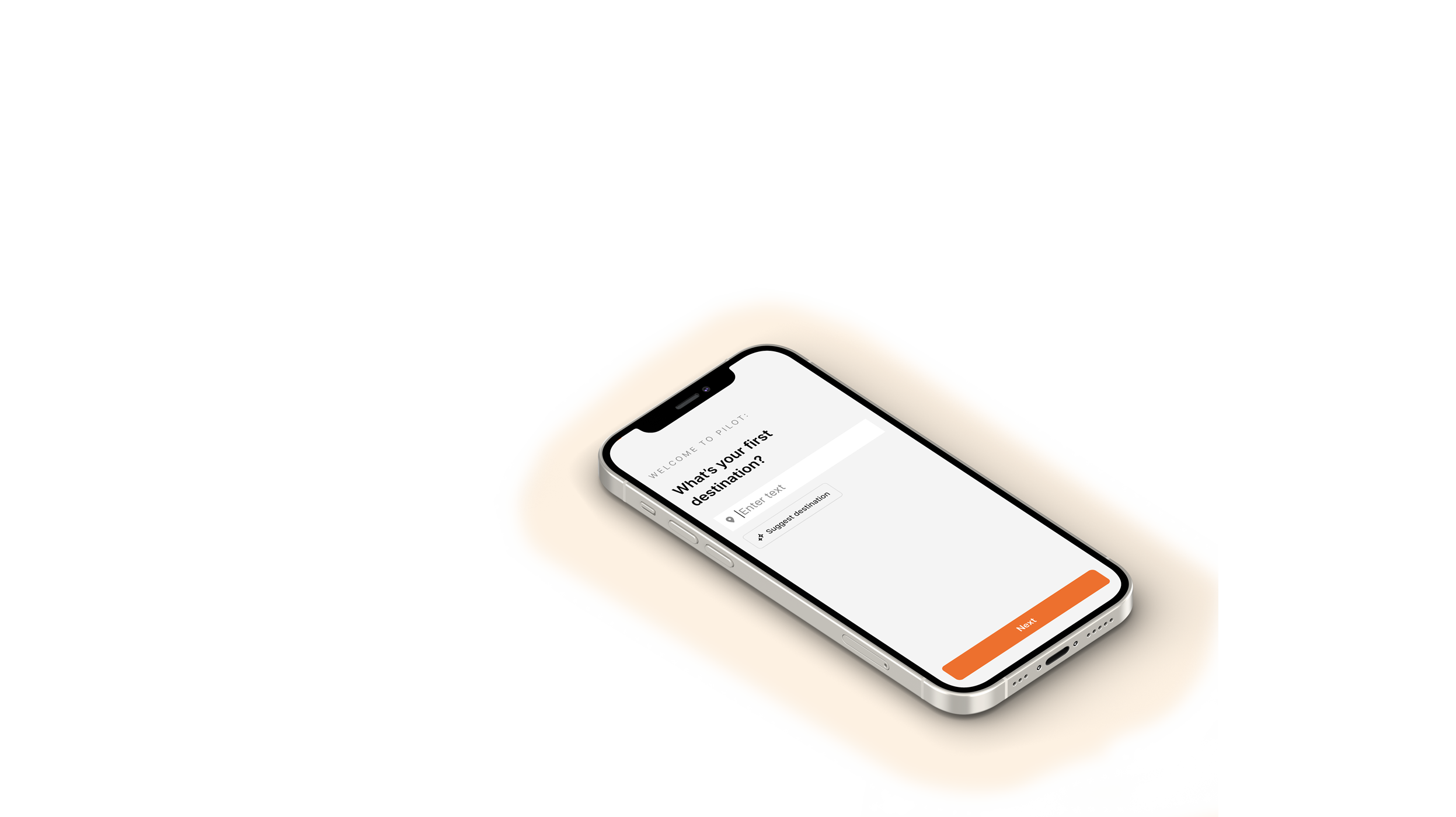
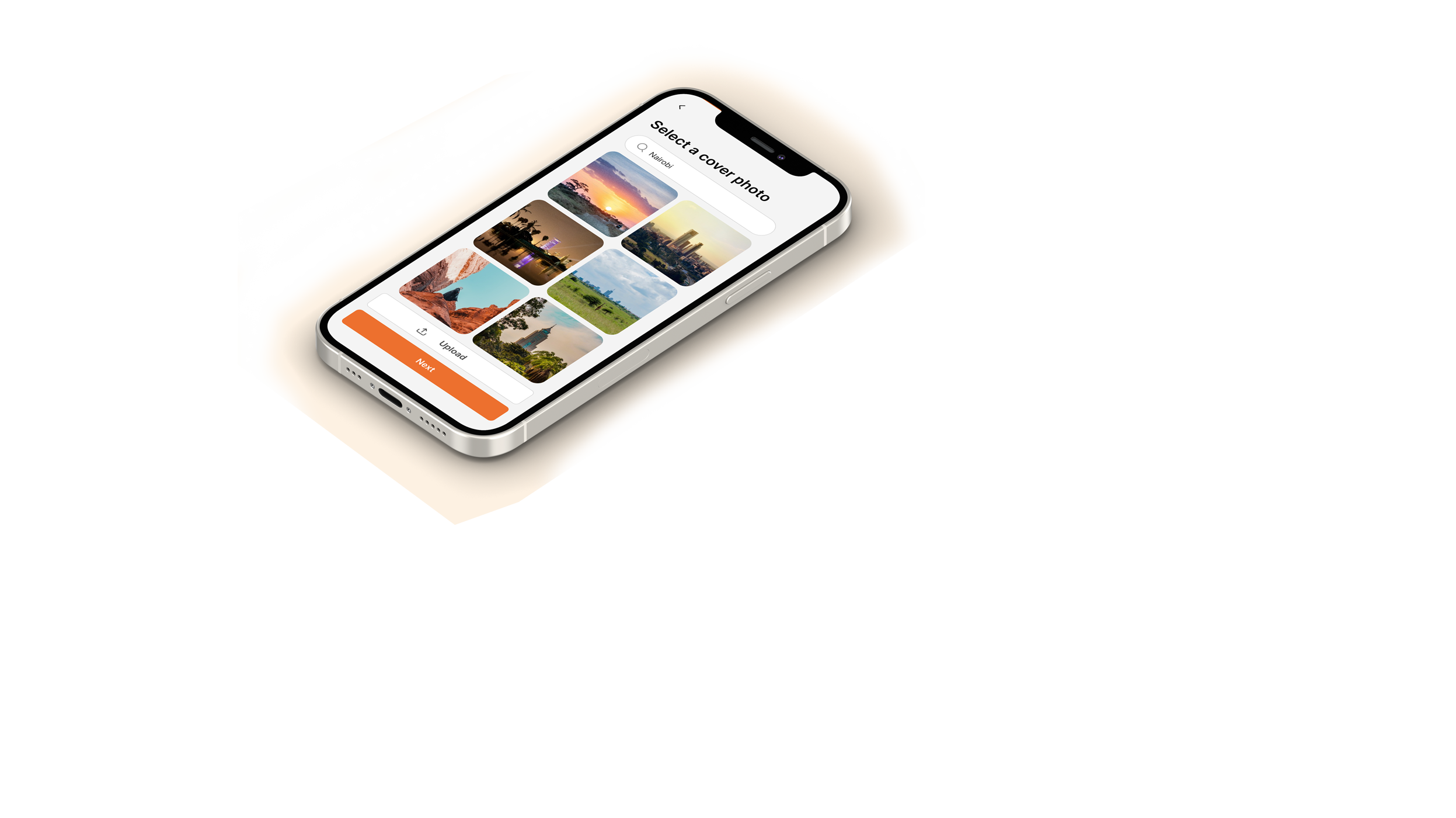
Wanting to provide the best possible user experience, we built an introductory flow using “progressive disclosure” asking users one question at a time, instead of overwhelming them with a long series of questions. In contrast to competitors that often asked several questions at once that frustrated users.
My goal was to design an experience that felt as natural and engaging as a conversation, with each screen seamlessly building momentum. Using storytelling frameworks, the onboarding journey represents the "rising action" of the narrative.
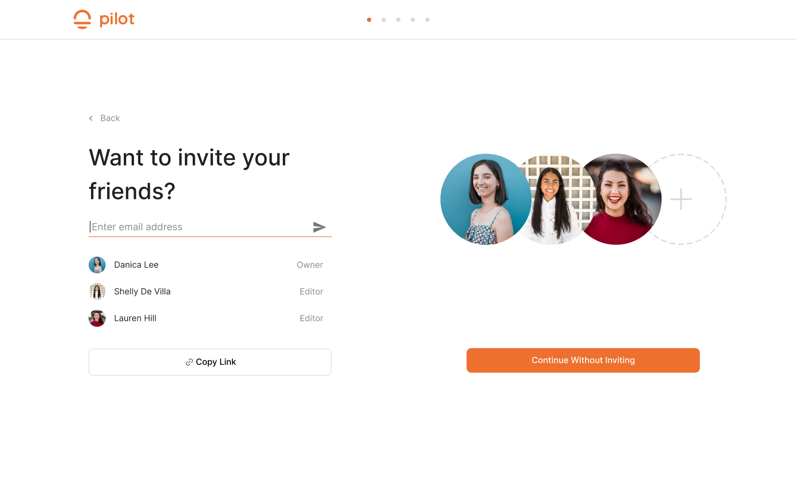
It begins with a simple question: "Where is your first destination?" Once the user responds, a trip card on the right side of the screen dynamically populates with an image of that location. As users name their trip and invite friends, the details visually come together, creating a sense of excitement and anticipation. The experience culminates with a prompt field for users to enter their preferences, allowing the app to generate personalized trip suggestions and see an overall picture of their trip.
Positive Outcomes:
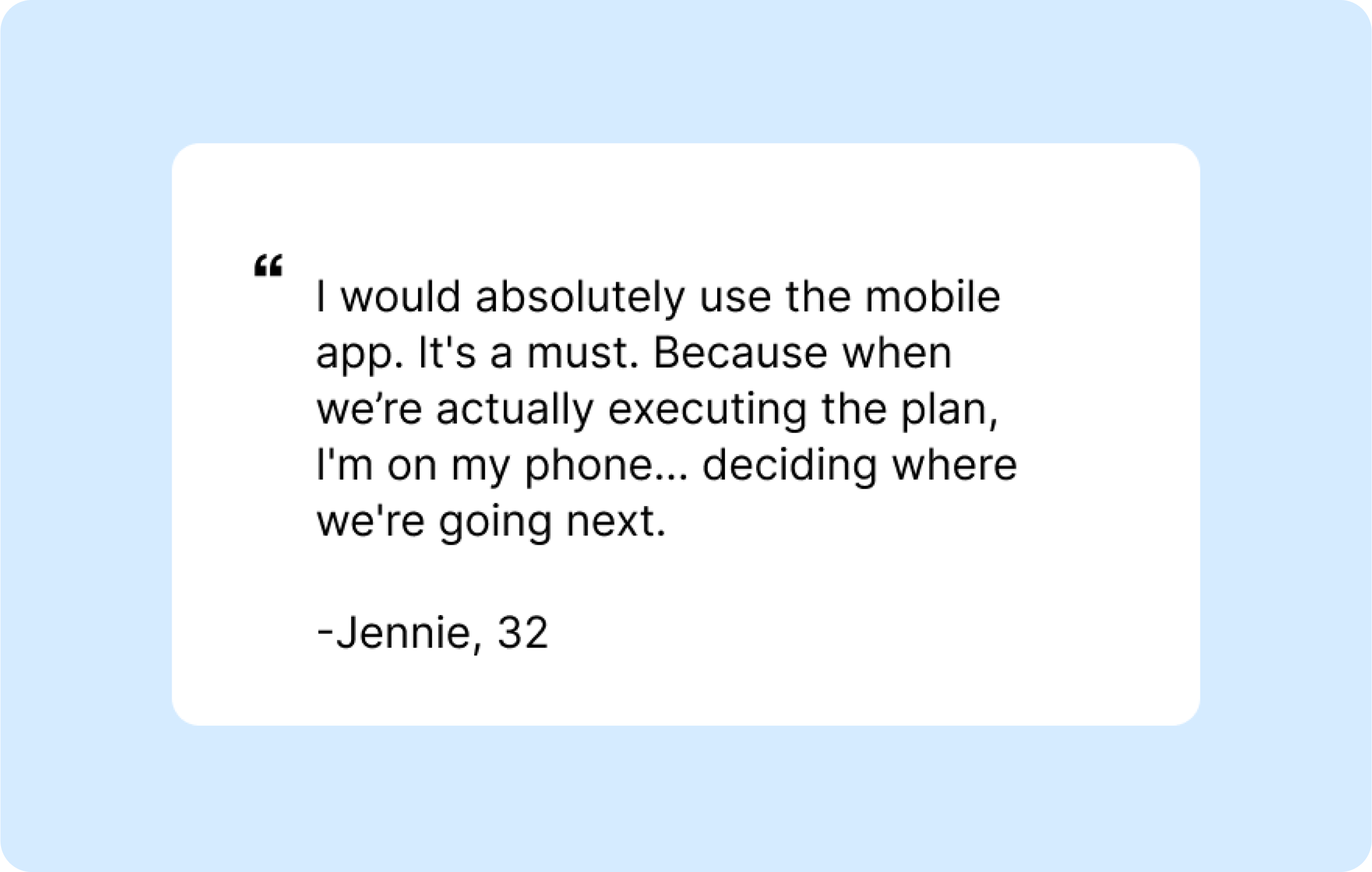
From A/B testing this Create a Trip Flow against the previous version, we learned it significantly increased activation and referral, especially in new users. We introduced the same flow into our mobile app which was adapted slightly for narrower screens. User’s enjoyed this feature, one saying:
One this implementation went public, people requested more access to Quick Start, after the initial round of suggestions. In response to this positive feedback, we are in development of a natively integrated AI feature that allows people to “chat with their trip” to generate even more suggestions, preview them on the map and add them to their plan.
Why build a mobile app?
In January 2024, we began research into how we might build a better experience on mobile devices. I observed the web app was widely used on touch-based devices but wasn’t keeping up with users’ expectations. Numerous user interviews and product surveys also echoed this sentiment:
We also heard from users that offline mode would be indispensable on their travels, same with app notifications, something that’s only possible with a mobile app.
In this context I took over leadership of this project. I set out to design a mobile app on iOS and Android as a companion to our desktop experience.
Phase 1: Debug/Derisk using Private Alpha Release
We wanted to move fast with the data we had so we built a private Alpha and released it to users to reduce the risk. I used my Android and iOS devices to map crashes and problem areas, tracing out every interaction in the app multiple times.
When I took over the project in January 2024, I knew from analyzing the data that we would need:
Positive Outcomes
Overall the Alpha had our power users excited and primed for our next release. Our QA process became more like a well-oiled machine and we really understood how every interaction of the core functionality should ideally work. This was the foundation for our Public release.
Phase 2: Building Public Beta Release
App Speed and User Perception
Despite the bug fixes, Pilot still fell short of what the Doherty Threshold recommends (<400ms response time between computer and user).
Working within a limited scope for this build, I problem-solved with the engineers to prioritize this user pain point. The load time was influenced by a number of factors that were unavoidable given the project scope so I was guided by one of Neilson & Norman’s 10 Usability Heuristics, the Visibility of System Status to overcome slow loading times. To decrease the users’ perception of the wait, I introduced load animations and pressed states for buttons.
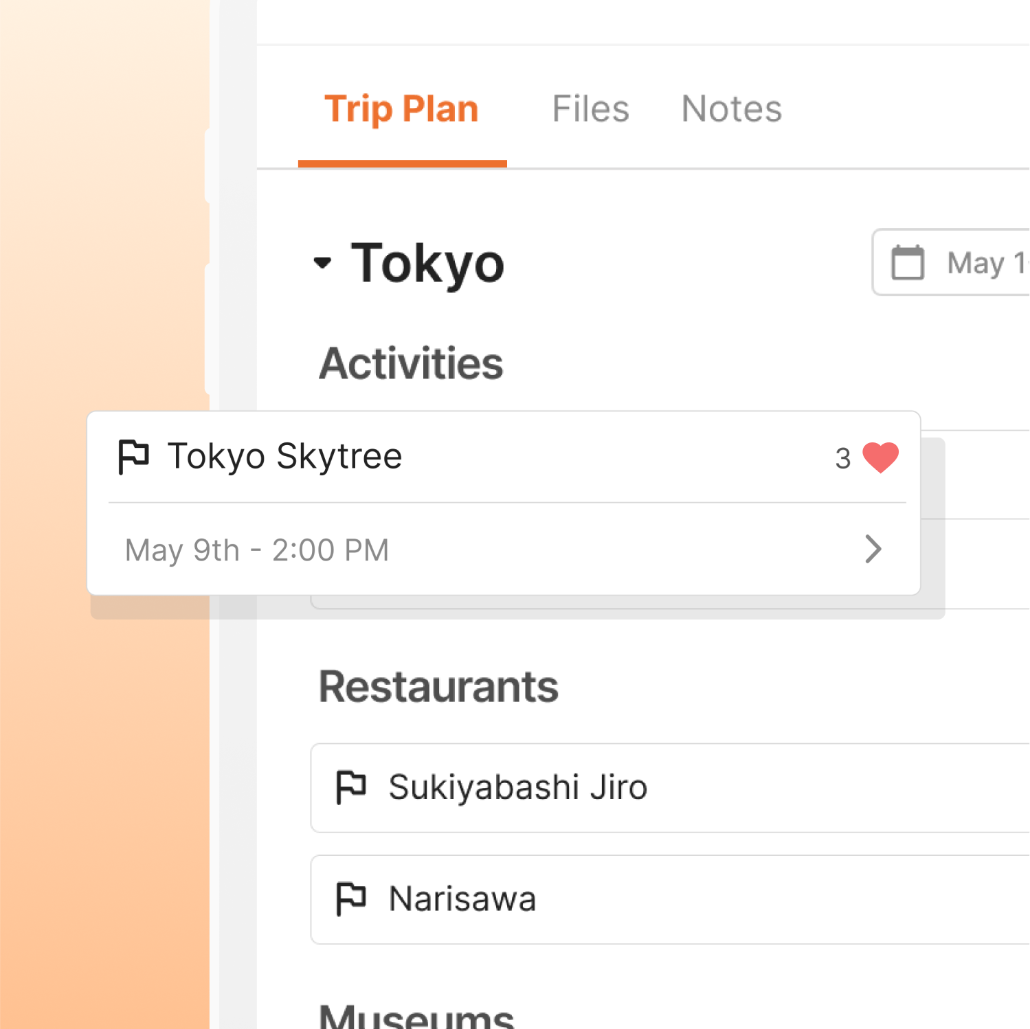
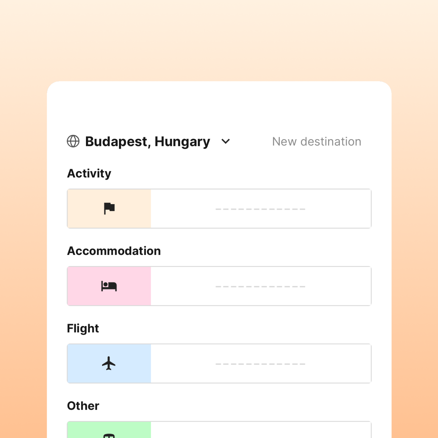
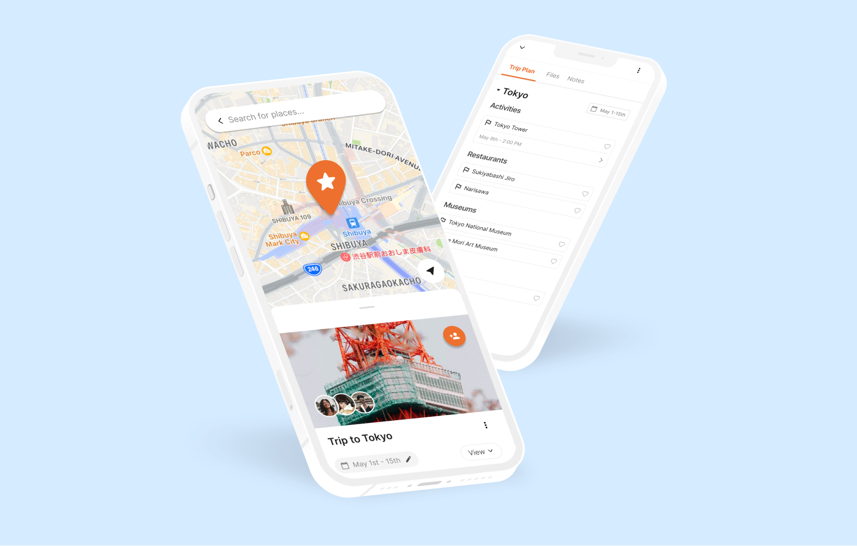
Map Functionality and Itinerary Structure
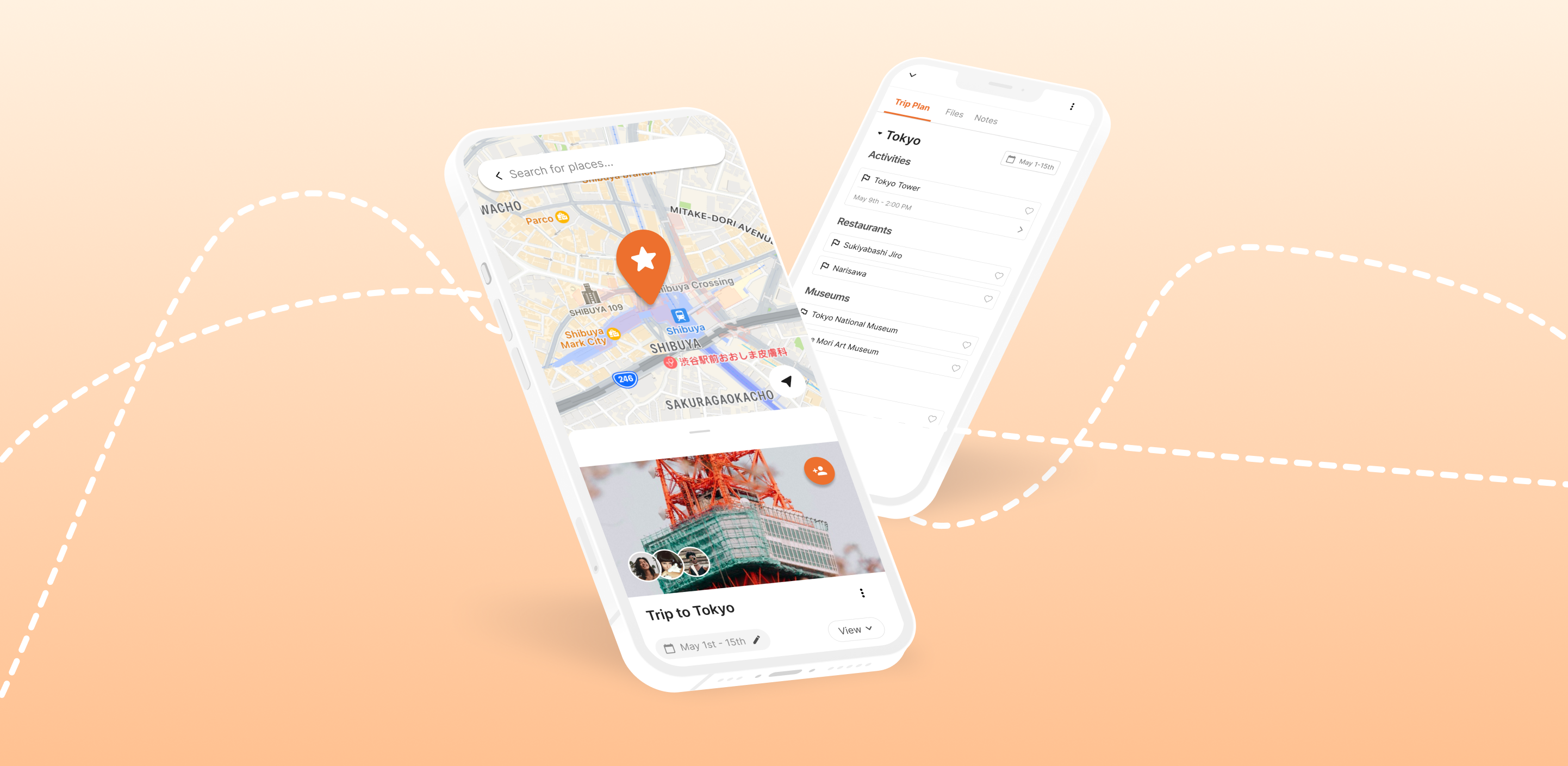
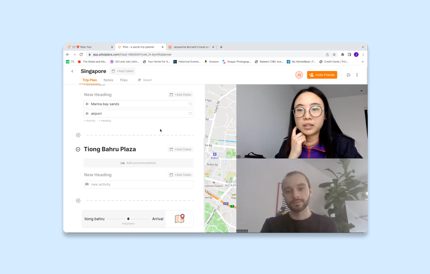
Consistent with user requests and the current desktop experience, we transformed the itinerary into a bottom sheet and introduced an interactive map in the background. In designing this overhaul, I followed Google’s latest Material UI standards for bottom sheet interactions.
In response to hearing from users that the add menu was cumbersome and hard to use, I changed the itinerary structure to be more flexible and give users more options to add various components, thereby creating a more satisfying experience.
With the previous version of the app users needed to understand our mental model of the itinerary structure. For example, before adding an activity, users needed to add a destination and a heading.
I remedied this issue by allowing users to add any item they wanted from the add menu and gave them a breadcrumb menu that allowed them to add blocks in different places within their trip.
This maintained the balance of flexibility and organization that web users expected of Pilot.
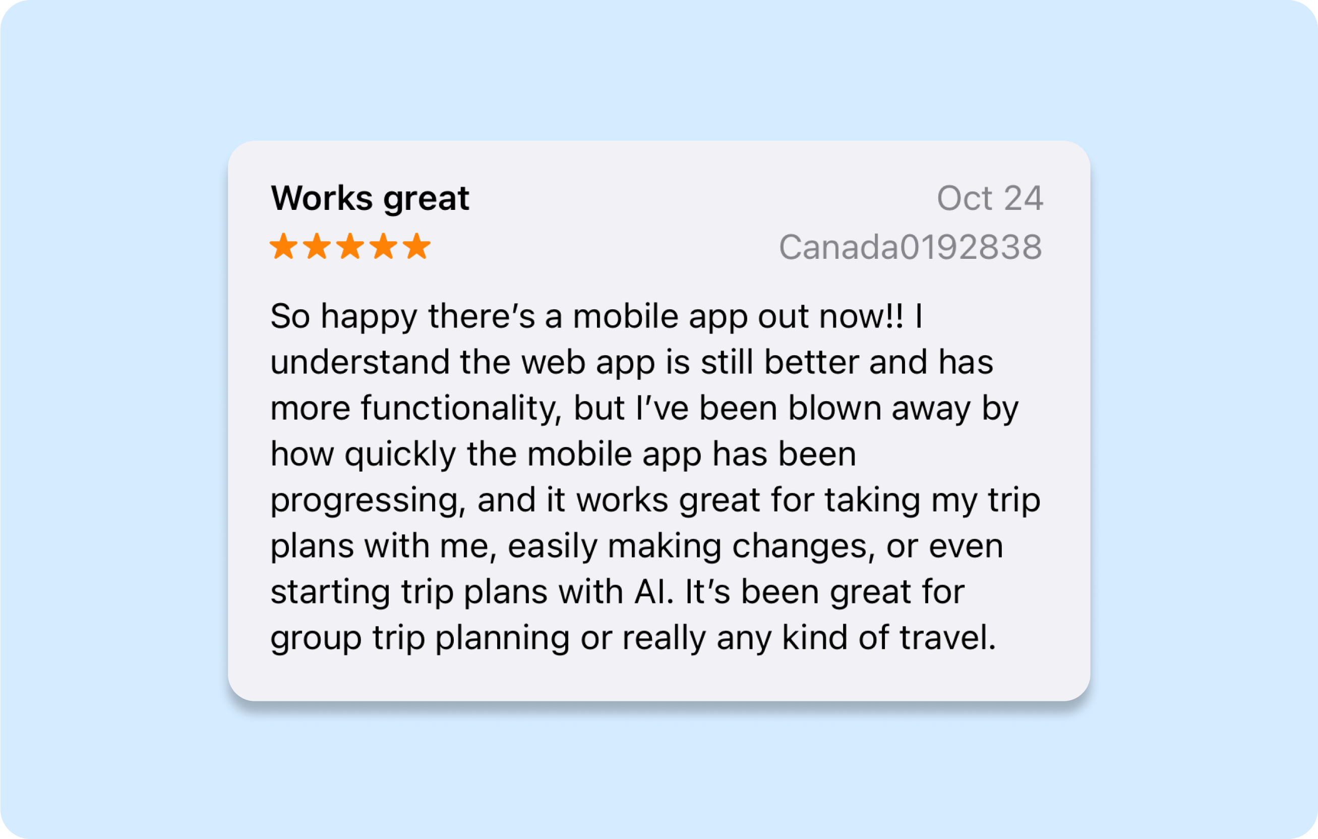
Positive Outcomes: From Challenging Alpha–to 5 Star App
Under my leadership and working collaboratively with PMs and engineers, we delivered a great mobile app in time to showcase it at TechCrunch Disrupt 2024.
In preparation for a full rebrand, I led a large project to create consistency across Pilot’s entire design system, using the Atomic Design Methodology, with rollout currently on-going. This project also served as an opportunity for me to mentor a junior designer who is learning to create hand-offs within our product process.
Here are some samples of the internal document I created for rebranded design system.
Foundations
Based on a 4pt grid, the foundations of the design system span across mobile, web and other applications to ensure a consistency throughout all touch-points with users. The above is just a sample of this section, in it's entirety it includes the rules for like and alike elements, interactions, shapes, and semantics for colour coding.
Styles
Based heavily on research with our target demographic, styles encompass the range of how our brand communicates using text, colour, icons, shapes and layouts. This is built such that the information is accessible by the entire team, yet still a living document that can be amended and changed with further iterations.
Components
As the building block for compositions, I craft components with enough rigidity to communicate in a consistent voice, yet enough flexibility to be applied app wide. In many cases such as for textfields and drop downs, components are varied between web, mobile and marketing applications.
Additionally, I designed numerous UI improvements to increase overall usability. The most notable of which are as follows:
Reflections
My work at Pilot has been a dynamic journey of designing user-centric solutions and driving impactful projects, such as the mobile app redesign and AI-driven Quick Start feature. By leveraging iterative testing and data-driven insights, we addressed key user needs like app speed, itinerary flexibility, and map functionality, culminating in positive user feedback and recognition as a Startup Battlefield company at TechCrunch Disrupt 2023.
Currently, I’m leading a rebranding initiative, overhauling Pilot’s design system while mentoring a junior designer, and restructuring the itinerary to enhance usability. These efforts reflect our commitment to delivering an intuitive, innovative platform that empowers users to plan and experience travel seamlessly.