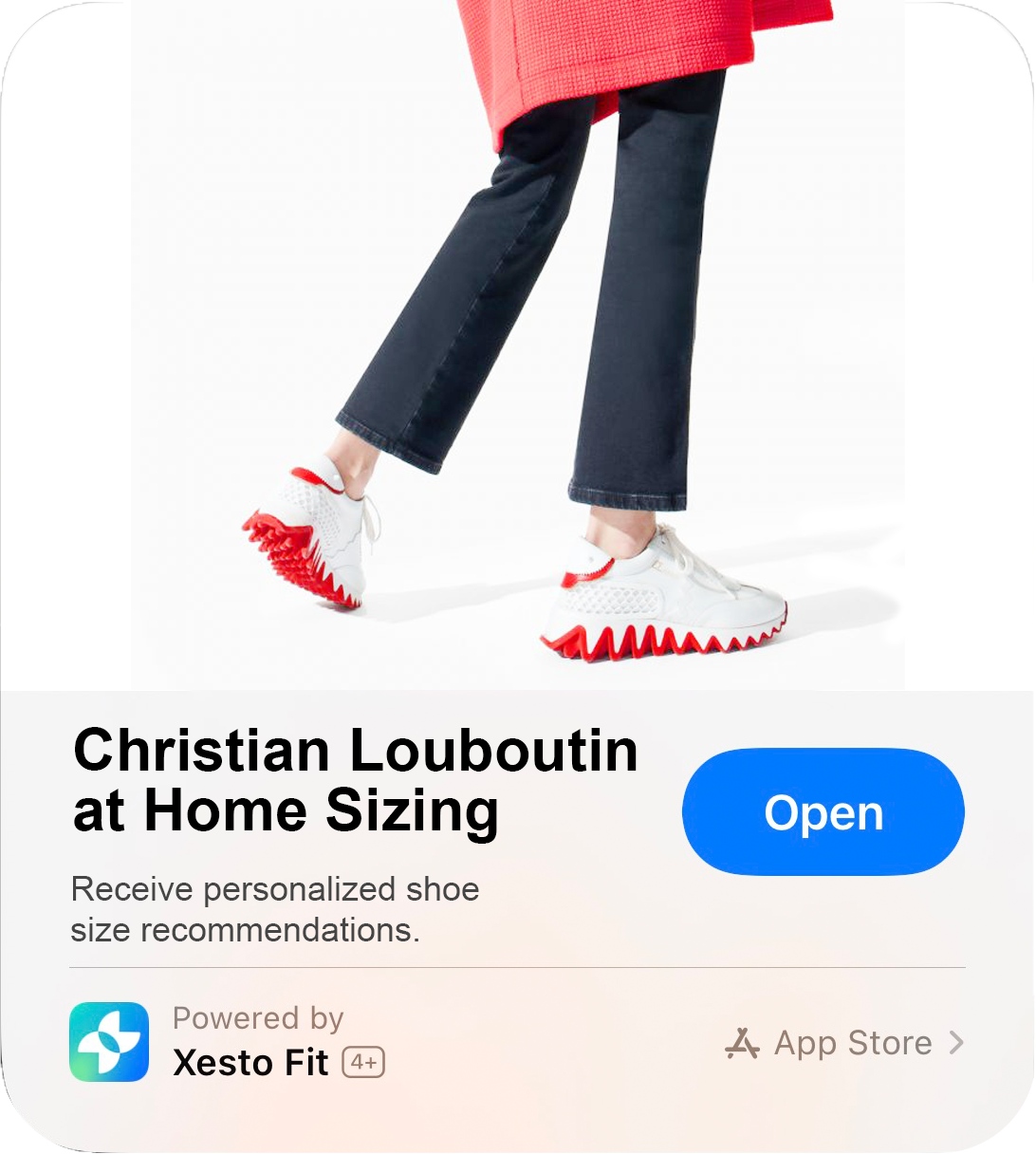
Xesto Fit is a tool that helps people find their shoe size across hundreds of brands based on a precise 3D scan.
While our team was in talks with luxury fashion clients who were facing significant challenges with customer returns from online sales, I was brought on board to improve product activation and accuracy, first through a redesigned onboarding and later to redesign the entire scanning experience.
Designing an Engaging Onboarding for Usability
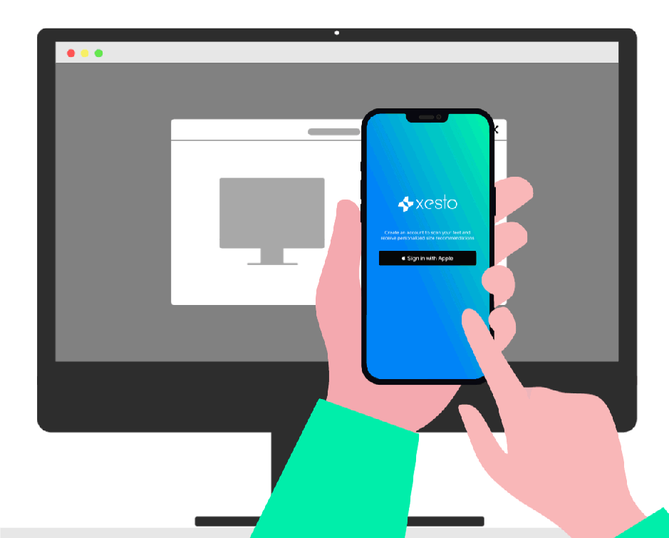
One of the key challenges as a UX designer at Xesto was educating users about the unique scanning process my UofT grad collegues had developed using the iPhone's FaceID camera.
We were often returning errors to users and it made sense, the early version of the app was asking a lot of them. To complete the scan users hold the phone upside down and tilted away from their eyes, which makes it challenging to what you're doing and maintain consistency. I ran user tests and found that missteps during the scan were hard to overcome. As a first step, we set out to improve the onboarding experience to provide clarity, build confidence, and set users up for success.
Step 1: Name your scan
It may seem like a small detail, but I discovered that asking users to name their scan at the start created a significant psychological shift. This simple task fostered a sense of personal ownership and investment in the process. By leveraging the Endowment Effect—the emotional bias where people value something more simply because they perceive it as their own—I transformed what could feel like a clinical interaction into a more personal and meaningful experience.

Step 2: Checklist
It was important to deter users from some common pitfalls I observed in our testing. The system advises users on the basics to get a great scan. I animated this sequence to show hints one-by-one. I brought drawings to life using Lottie (.JSON) Animated files and designed a nav bar that indicates how many steps are left in the onboarding.
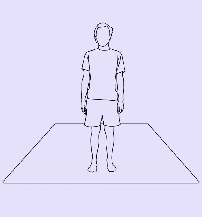
Step 3: Demonstration
Through testing I found users needed a clear demonstration of how to position their bodies while completing the scan. In previous versions I displayed a series of images of a model posing in different positions. It improved people's ability to use the app but made the app feel clinical, something we wanted to avoid as high-end fashion companies that we work were looking to partner with, needed to see how their brand fit with our product. In response, I animated an asset using Illustrator and After Effects that showed a person scanning around their foot. The black and white style was functional yet more sophisticated.
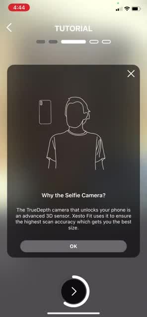
I animated a few more assets to show that the system uses the front-facing “selfie” camera and another that showed why you should avoid using Xesto on carpet.
Redesigning the Scanning Experience for Accuracy and Engagement:
In capturing precise 3D models using the FaceID camera, I faced issues with user engagement and accuracy. The process required users to hold their phone upside down and tilt it away from their eyes—a counterintuitive position that made it difficult to gauge progress and accuracy. Without clear guidance, this felt frustrating and was error-prone, detracting from the app's core value.
To address this, I focused on creating an experience that would guide users effectively and also make the process feel intuitive and engaging. I introduced haptic feedback, color-coded visuals, and sound cues to communicate when each scan was successfully captured, ensuring users felt confident and rewarded at every step.
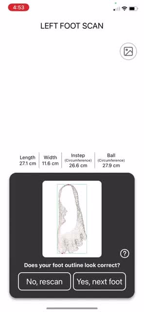
In addition to designing for error prevention, I also worked to provide consistent and encouraging feedback to help users recover from mistakes. The dynamic dial animation visually represents the different angles users needed to capture. This dial acted as both a progress tracker and a guide, helping users see which positions they’d completed and when they needed to try again.
If the system is unsuccessful, I designed the experience to help people recover from errors. A series of system actions guided the user; the screen flashed red, the phone vibrated and indicated the problem with text, Eg. too far away, and in the representation of the dial, the phone appears “too far away” as well.
Web Branding:
Xesto’s website needed a refresh to attract clients, who ranged from luxury fashion brands to high-end sporting companies. As the site was critical for lead generation, it had to be responsive across all devices, informative and on brand. I used Webflow and designed assets to reflect the R&D that our team worked so hard to achieve at the University of Toronto.

Positive Outcome
Before my 6 month internship expired, Xesto extended my contract an extra month. The result of my efforts was a scanning experience that transformed a clinical task into an intuitive and almost game-like interaction, making Xesto Fit not just a tool but an exciting experience users enjoyed returning to.